

As reported, yesterday at the Mega Launch event, Xiaomi unveiled its new foldable phone, the Mi Mix Fold. Alongside this, the company also revealed its new logo.
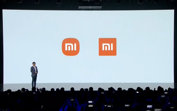
The rebranding project, including the logo redesign, started back in 2017. After years of development and hiring Japanese designer Kenya Hara for 2 million yuan (about 7 billion VND), Xiaomi officially unveiled the new logo yesterday.
Despite the effort and cost, many people say the new logo looks almost the same as the old one:
– Honestly, it looks the same, just swapped the outer square shape.
– The new one definitely looks smoother and more pleasing, rounding the corners is an art worth “2 million yuan”!
– The real skill here isn’t the logo design but convincing the company to be happy with it.
– Amazing, the new logo shines with a fresh vibe but leaves the same impression.
– The new look definitely feels more premium, like it costs money haha.
– If you’re so good, design the same logo and convince Xiaomi to accept it. Clients always say “I could do this too” when they get work from designers or copywriters.
Some even suspect this is just a marketing stunt:
– Just a branding wave to stir things up.
– Smart marketing, whether it’s pretty or not, 7 billion VND to get millions or billions of eyes worldwide isn’t expensive.
– Xiaomi is clever, spending little but getting global branding exposure.
– A very successful marketing campaign at a low cost.
At the event, CEO Lei Jun was asked:
“Are you disappointed with the new logo? It’s just rounder than the old one.”
Lei Jun replied, “Don’t worry, Xiaomi isn’t just changing the logo from square to round, but also the company’s internal spirit and brand mindset. Rest assured.”
He added that the new logo highlights a fresh identity Xiaomi will bring in the future.
The new design features softly rounded corners, resembling smartphone app icons.
Designer Kenya Hara said, “The new logo isn’t just a shape change, it reflects Xiaomi’s internal spirit. It basically represents the concept of being alive.”
The name “Alive” conveys Xiaomi’s philosophy and approach, symbolizing how humans live in harmony with technology, something created by humans themselves.
This makes technology feel more alive and essential to meeting human needs. Hara emphasized this idea fits Xiaomi perfectly, as the brand has brought many conveniences through its innovations.
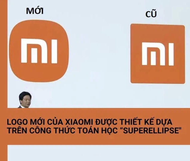
To create such a meaningful logo, the designer used advanced techniques, including the “superellipse” mathematical formula. He adjusted variables to achieve an optimal dynamic balance between square and circle shapes.
The superellipse is a curve similar to an ellipse but closer to a circle, discovered by French mathematician Gabriel Lamé. Depending on the formula, it can transform from a four-pointed star shape to a rounded square.
Xiaomi will keep orange as the main color, but black and silver variants might appear on premium products in the future.
Source: Compiled

